



Mobile-First Shopping Experiences
Deliver a seamless shopping experience on every screen with mobile-first e-commerce design. From product discovery to checkout, we optimise your online store for usability, speed and easier purchases on smartphones.
- check_circleMobile-first responsive store design
- check_circleTouch-friendly product browsing and navigation
- check_circleStreamlined mobile checkout experience
- check_circlePerformance and Core Web Vitals optimisation
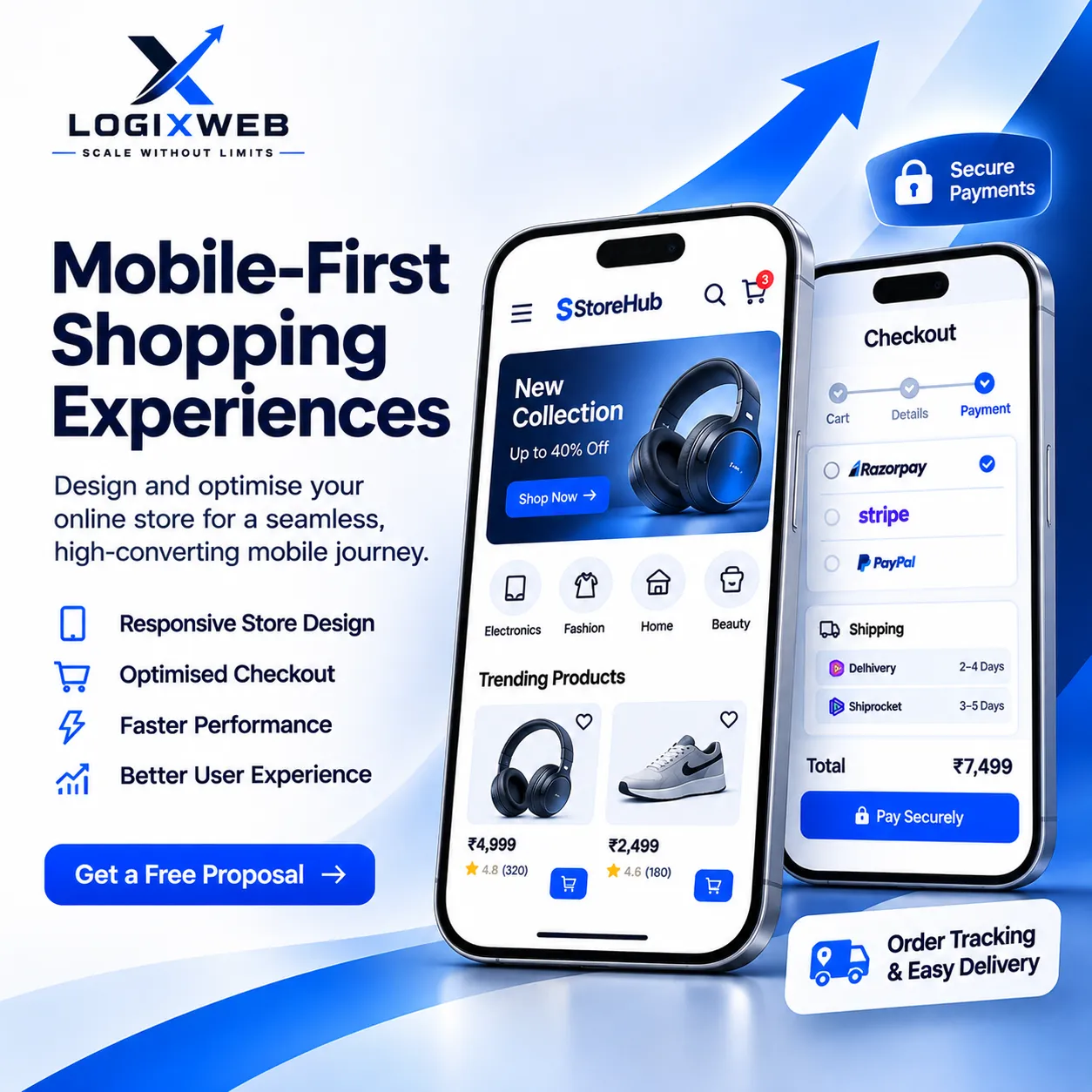
Turn Mobile Visitors Into Better Shopping Experiences
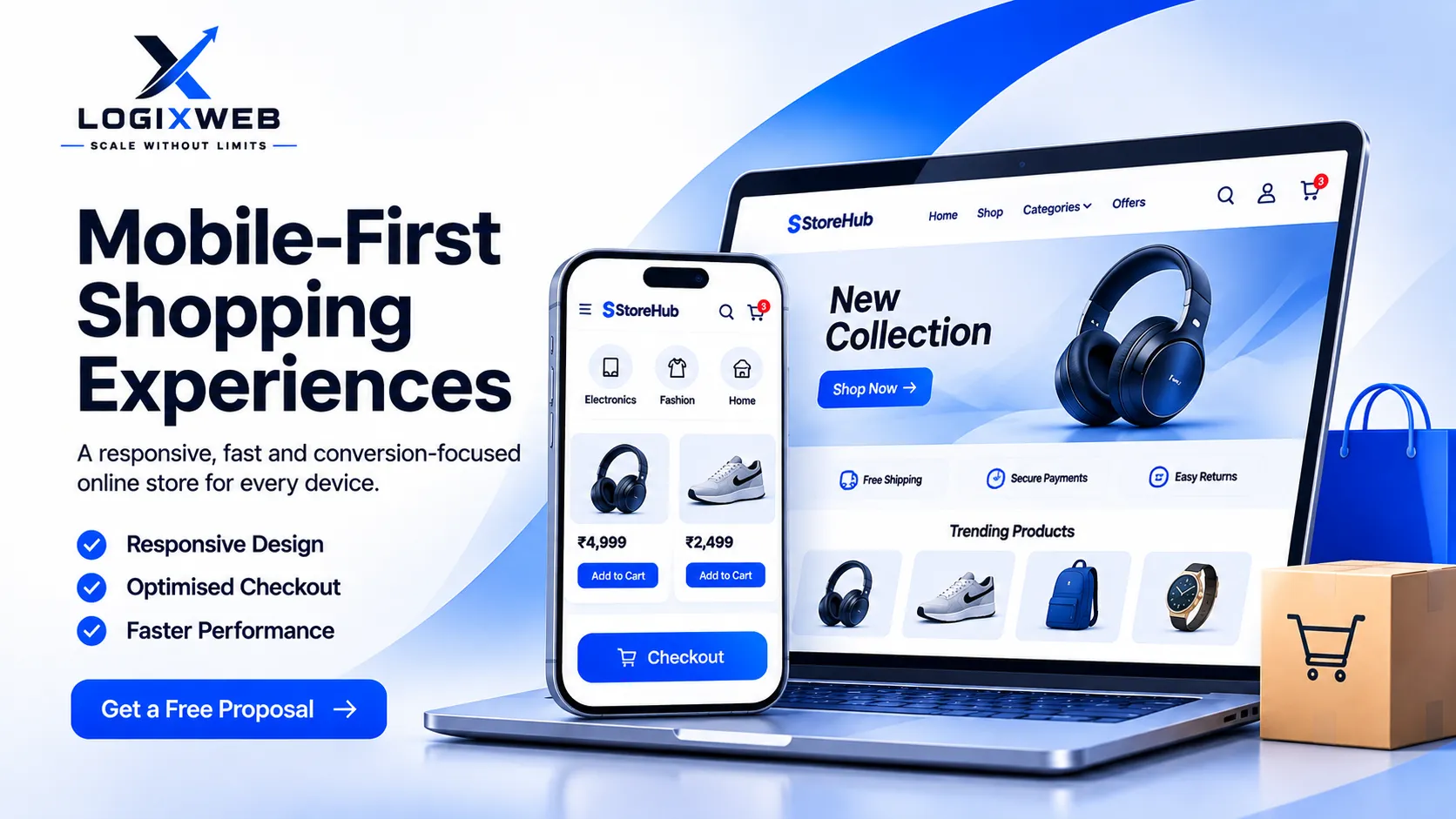
Deliver a seamless shopping experience on every screen with mobile-first e-commerce design. From product discovery to checkout, we optimise your online store for usability, speed and easier purchases on smartphones.
Everything that is included
Mobile-First Store Design
Design product pages and shopping layouts around smartphone users
Responsive Product Pages
Adapt product images, descriptions, pricing and options to different screen sizes
Touch-Friendly Navigation
Make categories, filters, menus and buttons easy to use on mobile devices
Mobile Cart Optimisation
Create a clear cart experience with easy quantity and item controls
Streamlined Checkout
Reduce unnecessary steps and improve the mobile purchase flow
Payment Integration
Configure compatible payment methods for mobile checkout
Mobile Speed Optimisation
Review image sizes, scripts and page performance to reduce loading delays
Cross-Device Testing
Test key shopping journeys across supported mobile, tablet and desktop screens
What this means for your business
Better Mobile Usability
Help customers browse and shop with fewer usability obstacles
Smoother Checkout
Make the path from product selection to payment easier to follow
Consistent Brand Experience
Keep your store visually consistent across screen sizes
Improved Performance
Identify mobile speed bottlenecks and prioritise practical fixes
Conversion-Focused Design
Reduce friction in key shopping journeys without guaranteeing sales results
Our step-by-step process
A clear, transparent way of working, so you always know what happens next.
Mobile Experience Audit
Review the existing store on common mobile screen sizes
UX Planning
Map product discovery, cart and checkout journeys
Mobile-First Design
Prioritise layouts, navigation and touch interactions for smartphones
Development & Optimisation
Implement responsive layouts and performance improvements
Testing & Launch
Validate shopping flows across supported devices and browsers
Tools we use
Packages & pricing
Simple, transparent plans. Need something different? We will build a custom plan for you.
Starter
- Responsive layout review
- Mobile navigation improvements
- Product page optimisation for mobile
- Basic cart usability improvements
- Testing on common screen sizes
Growth
- Everything in Starter
- Mobile-first product page refinements
- Cart and checkout UX improvements
- Image and asset optimisation
- Performance review and key fixes
- Cross-device shopping flow testing
Scale
- Advanced mobile shopping UX improvements
- Custom responsive components
- Complex product and variation layouts
- Advanced checkout refinements where supported
- Broader device and browser testing
- Performance optimisation and handover
Prices exclude taxes where applicable. Need a custom scope? Talk to our team.
Industries we serve
Frequently asked questions
What is a mobile-first shopping experience?add
Can you optimise my existing WooCommerce store for mobile?add
Will mobile optimisation improve conversions?add
Do you optimise mobile website speed?add
Will my store work on tablets and desktops too?add
How much does mobile shopping optimisation cost?add
Copy all FAQsadd
Explore our other services
Make Every Mobile Visit Count
Tell us about your business. We will reply with an honest audit and a clear, no-obligation plan.
Choose a plan
Get started with the plan
Leave your details and our team will get back to you within one working day.
- Reply within 1 working day
- Free, no obligation
- 210+ websites delivered
Thank you! We have your request.
Want a faster reply? Send us the same details on WhatsApp.
Continue on WhatsApp